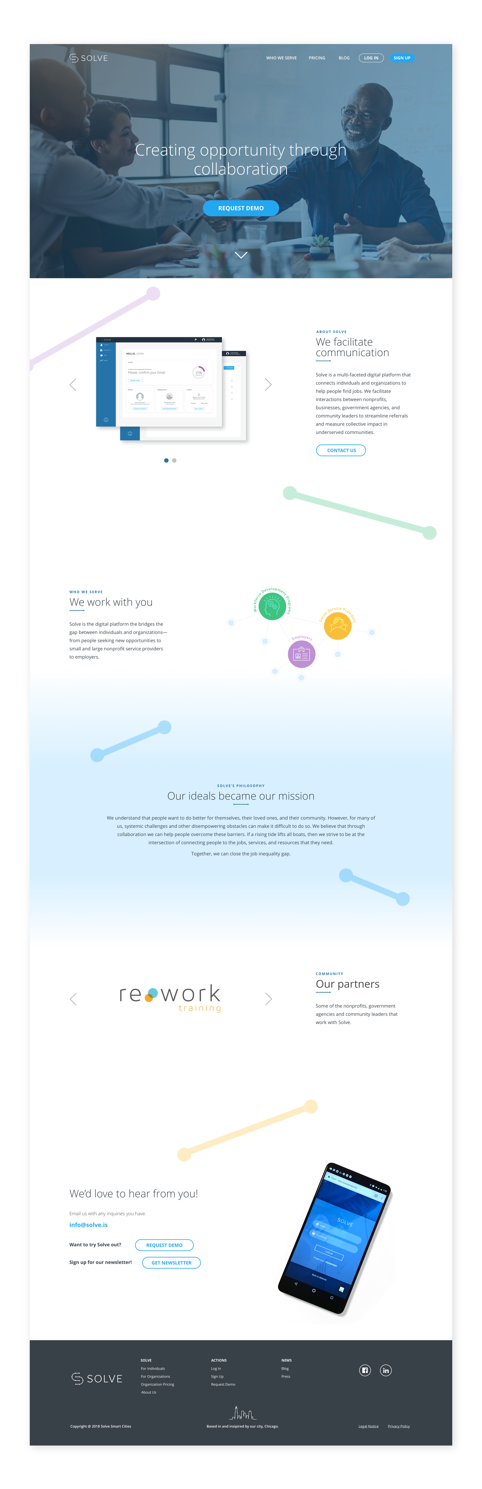
Solve is a mission based tech start up that facilitates interactions between nonprofits, businesses and agencies. The digital platform helps streamline referrals between organizations while measuring their collective impact. Solve brings everyone together, giving them access to a network of jobs, social service providers and training programs so that they can empower the individuals that they work with.
In the branding capacity of my role, I was able to work closely with both co-founders to understand what they wanted their identity to represent: technology and collaboration while still connecting Chicago in some way. After a couple of design rounds, below is the chosen design.
I was also able to coordinate the company’s strategy to ensure the brand reflected the voice of the company across all channels.
Role: Brand design, UX/UI Design.
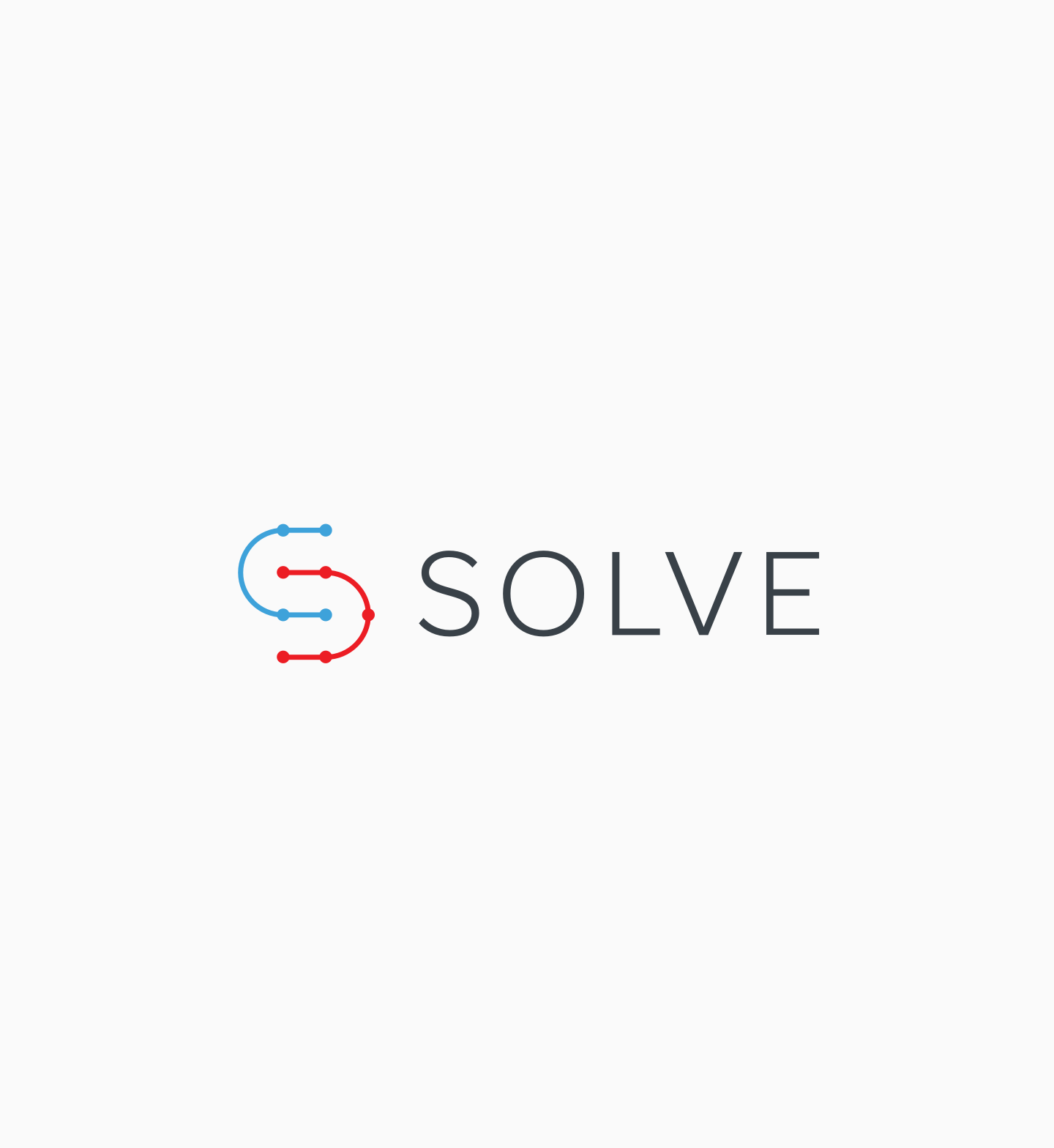
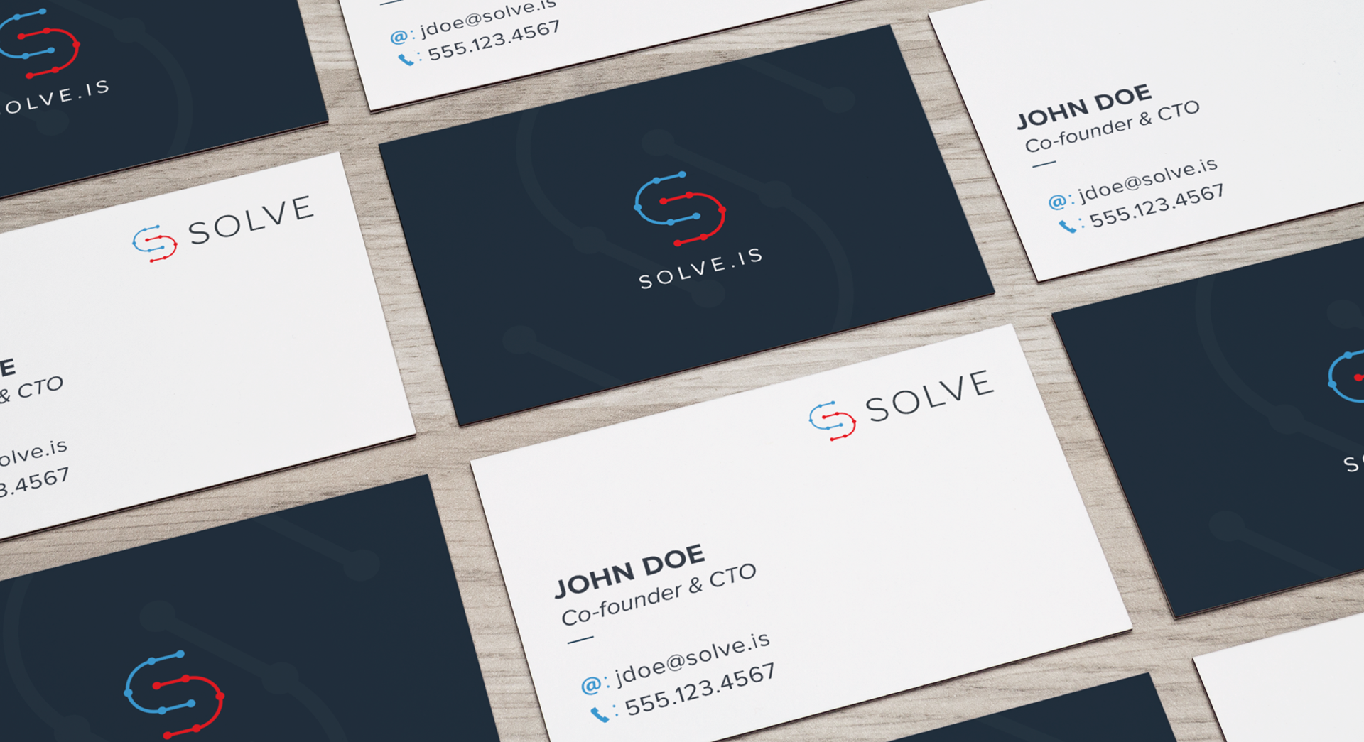
The "S" icon represents technology and how two different audiences come together (showcased by the two different colors on the icon). To tie it with Chicago, I chose red and blue from Chicago's flag.
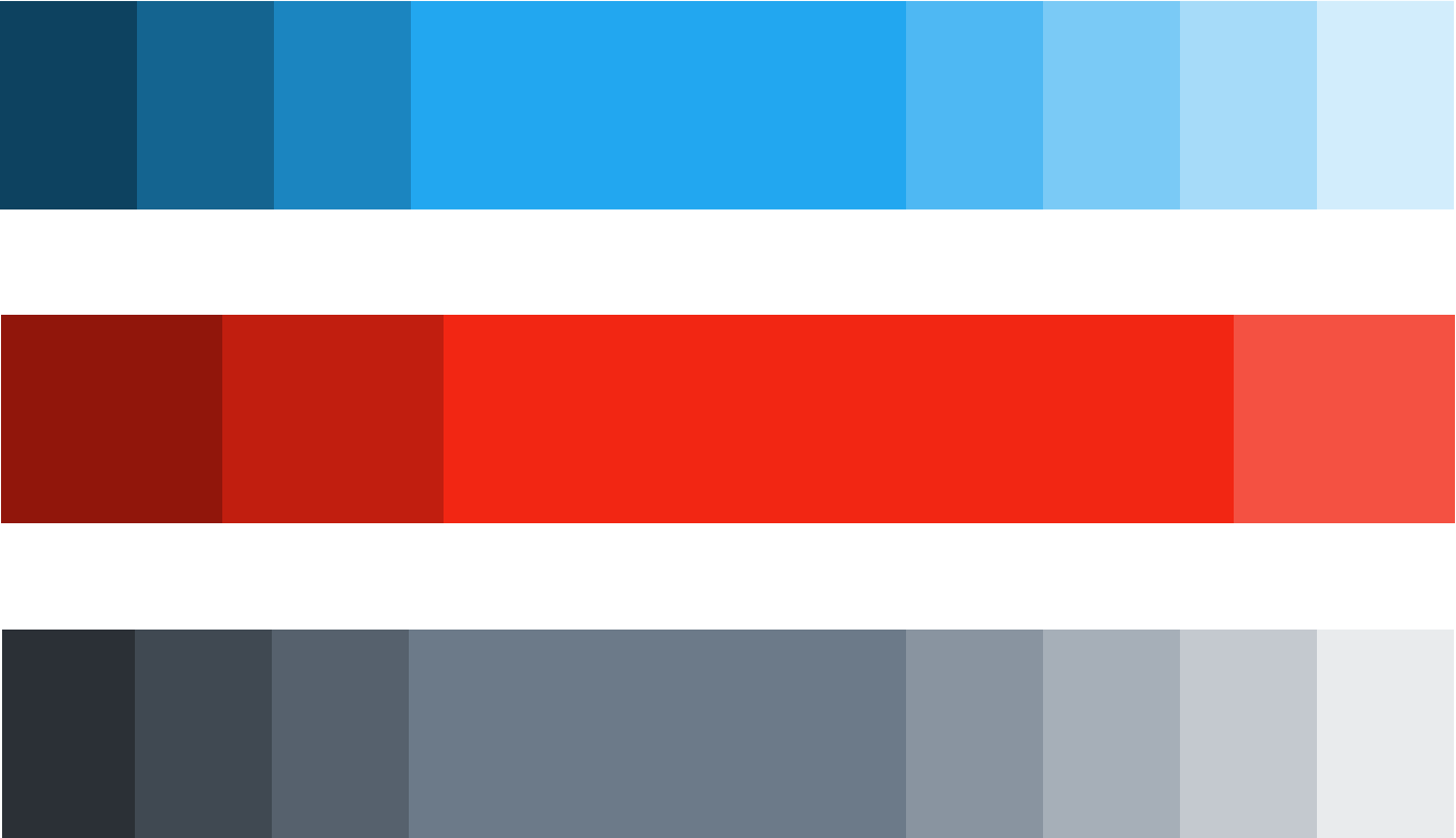
secondary colors